Essay · CAPITALISM
The Zero-Indexed Stock Market

The major pop finance websites (Yahoo Finance, Google Finance, The Motley Fool) purposefully lie to you.
What’s their lie?
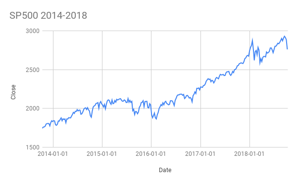
They lie by using this chart:
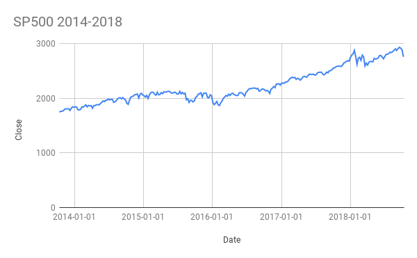
Instead of this chart:
Can you tell the difference?
- in the first chart, the Y-axis (vertical) in the initial chart is chosen arbitrarily
- in the second chart, the Y-axis starts at 0
Why does this matter?
This matters because these pop finance websites are trying to fool you.
They are trying to mislead you into believing that there has been a bigger magnitude change in the index or stock price–by skewing your visual perception of the price change over time to make it looker bigger.
Why would they do that?
Because you will react more emotionally when you perceive a higher magnitude change than an honest representation of the price change over time.
Looking at historical prices, always look at zero-indexed charts.
This will prime you for rational decision-making.
You will make decisions with a more honest representation of price history–the exact goal of using data visualizations in the first place!
Enjoyed this post? Get new posts via email